Evolution of an Interaction
I thought it might be interesting to share my thought process on the design of one the pages in my web UI development class project from the initial conception through final result based on what I’ve learned from several rounds of usability testing.
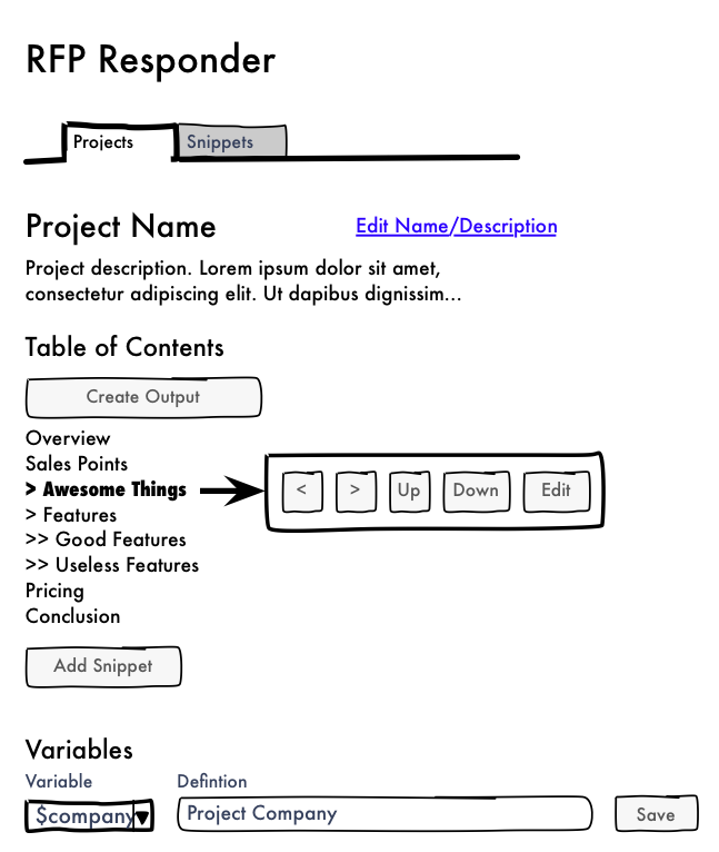
Here’s the initial sketch:
The screen lets you organize chunks of boilerplate text into a table of contents so that you can build a document out of saved chunks of texts. Users need to be able to add content to the table of contents, rearrange the contents, and set the hierarchy of the topics in the table of contents. The original concept was to have a hover menu that lets users click up, down, promote in hierarchy, and demote in hierarchy buttons.
However, after spending some quality time with jQuery UI, I decided that the interaction would be a lot better if you could drag and drop the topics to reorder them. .sortable() makes this really easy. And by using some AJAX at the end of a sort action, I can save the users the great pain of having to reload the page every time they reorder. It’s pretty neat.
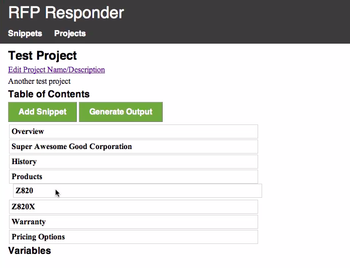
Here’s what I got up and running in time for my first usability test:
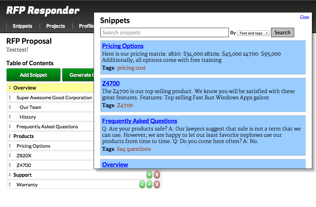
It wasn’t fully functional (the promote and demote buttons weren’t there yet), but the drag and drop ordering worked well.
What I found in my first round of usability testing was that no one could tell that you could drag and drop the topics to reorder them. Once participants guessed that, they had no trouble reordering. But until they guessed, it was definitely confusing.
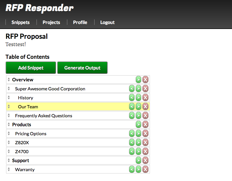
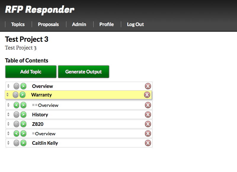
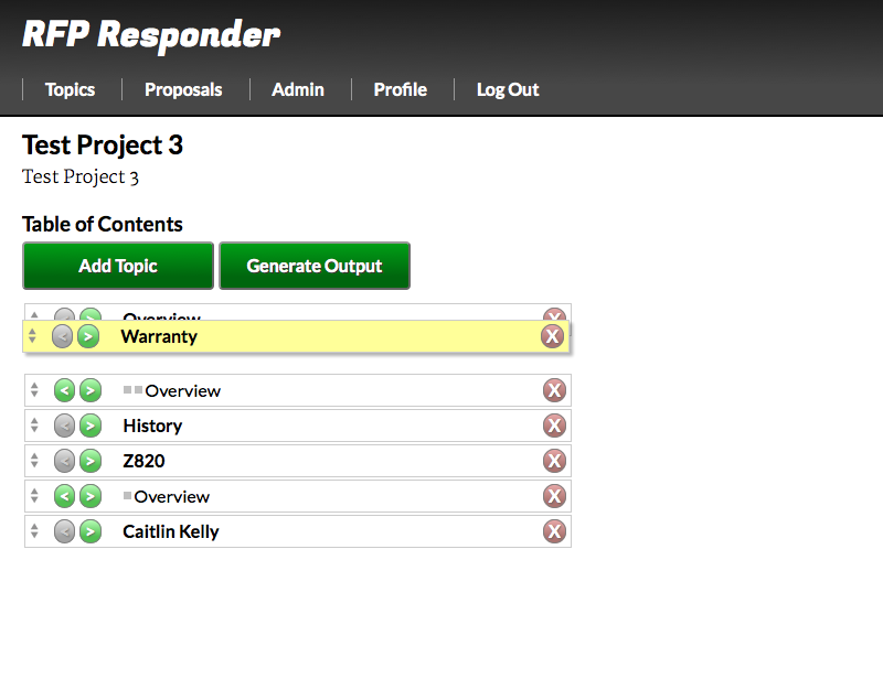
As I said in a previous post, my approach to fix the affordance problem was to come out guns a ‘blazin’. I highlighted the topic when users hovered and changed the cursor to the move cursor. I also added a little up/down icon to each item to indicate that it was sortable. I hoped that this would clue users into the idea that the table of contents was interactive and that dragging and dropping would be the first way they would try to sort the list. Here’s what I came up with:
My second round of usability testing was much more successful. Participants had no trouble figuring out that the list was drag and drop. They commented on how easy and enjoyable it was to use. I was pretty excited with the result. (Interestingly, several participants said in follow up questions that they were initially confused as to whether the screen was drag and drop even though all six participants had no trouble using the system.)
The screen was not without it’s issues, though.
- The topic list covered up the action buttons, so the first time you interacted with the page, there was no way to see how to promote/demote and delete topics until you closed the topic window. It also meant that you could not perform all of the table of contents organization functions with the add topic window open.
- I relied on indent level to show the hierarchy of the screen. As I should have known from psychology, users had a hard time distinguishing the level of the topic just by the amount of indent. It was hard to see the difference between a level 3 and a level 4.
- I still wanted to tackle the drag and drop affordance issue a little more.
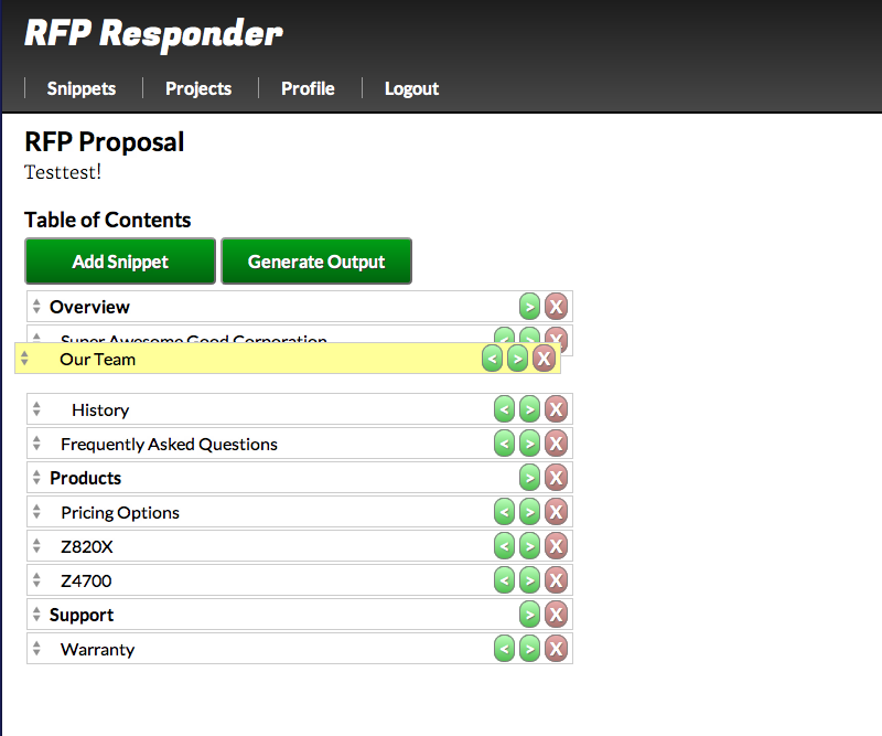
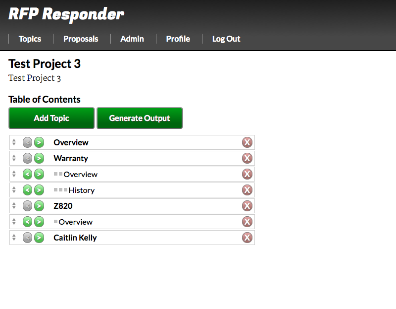
Here’s what is pretty close to the final screen as updated based on those issues:
The topics get a subtle little pop-out effect on hover, meant to suggest to the users that they’re little cards or tiles that can be picked up and moved around. The promote/demote buttons are now on the left side of the topic so that they’ll be apparent immediately. Finally, I added little dots to the screen to show the hierarchy level of each topic. Now, when you demote a topic, it gets another little dot to go along with the indent.
This screen is really the showpiece of my application. I’m pretty happy with how it turned out.
