Affording Drag and Drop
Coincidentally, the question of the weekend for the projects in both of my classes revolves around how to indicate that an item in a web application supports drag and drop.
- In my Web UI Implementation project, a crucial part of the application is the ability to order a list of topics in the table of content for a document. While I had yet to even attempt to style the list in any way to indicate that the interaction required drag and drop, my usability testing indicated that this was confusing for even the most sophisticated users I tested.
- In my User-Centered Design class, my partner and I are working on redesigning an application that allows instructors to comment on assignments they are grading by dragging and dropping reusable comments onto the assignment. Experienced users know that dragging and dropping (for both new and existing comments) is the only way to add comments to an assignment, but how do you indicate that to first-time users?
After doing some research, it seems that there aren’t any set standards yet for indicating something in a web application supports drag and drop. This is also complicated by the fact that there are a number of different types of drag and drop implementations: ordering lists, like my table of contents example; more free-form, like the Markup tool; and even dragging from outside the web browser, like the upload files feature in Gmail or WordPress.
The good news is that once users figure out that they can drag and drop, they have little trouble doing so. My most technically challenged tester even said she had “fun” dragging and dropping the table of contents items in the usability test. So the trick is simply to let the users know it is a possibility. This probably explains why so there are so many examples of drag and drop interfaces with instructions (see Google Plus Circles).
While similar challenges, I’m trying out completely different solutions in my two projects.
For my table of contents, I’m coming out guns a’blazin’ with several tacts at once. I’ll add some sort of drag handle graphic (like in Gmail or Basecamp or the Jquery UI examples), change the icon on mouseover, and change the color on hover. My guess is that none of those things will specifically indicate dragging is allowed, but will at least give enough indication that the table of contents is interactive that users will try that first. I’ll find out when I run the second round of usability testing.
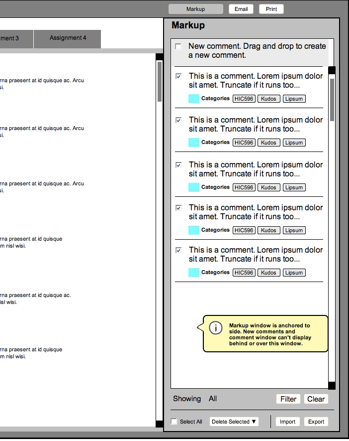
For the Markup application, I suggested replacing the New Comment button (which indicated it was drag-and-droppable with a tool tip) with a “comment” anchored to the top of the list. The “comment” would be of the list, but wouldn’t scroll. It would indicate that you drag and drop it onto the assignment to create a new comment. It would provide quick training to new users on how to interact with the application without getting in the way of experienced users, only taking up a little more room than the Fitts’ized button I used in my first sketch. It might look a little something like this:
